

Brand Manual
Welcome to the Vim Brand Manual.
This brand manual is our shared guide for telling Vim’s story with clarity and consistency. It exists to help every one of us communicate with confidence, so our audiences experience the same bold, modern, and trustworthy Vim at every touchpoint.
View brand kit
View employee kit
Table of Contents
1.0
Brand Foundations
1.1 Positioning Statement
Vim is the transformational platform modernizing healthcare, not just improving it incrementally.
- A frictionless ecosystem: where providers, care teams, payers, and developers collaborate seamlessly to close gaps, align incentives, and deliver value-based outcomes.
- An AI-driven growth engine: powering intelligent automation, context-aware insights, and scalable innovation across the ecosystem.
- A trusted infrastructure: secure, compliant, and simple to adopt, enabling care orchestration and real-world impact.
- The healthcare app marketplace: the fastest way to embed innovations directly into clinical workflows.
In short: Vim positions itself as the bold alternative to outdated, fragmented systems; a next-generation, developer-first platform that embeds the right tools directly into clinical workflows to eliminate friction, accelerate innovation, and improve outcomes across healthcare.
1.4 Brand Principles
Brand principles are the core beliefs and guiding values that shape how a brand operates, communicates, and delivers value. They are the foundation of a brand’s identity both visually and verbally, helping to ensure consistency across messaging, product development, and customer interactions.
2.0
Core Visual Identity
2.1
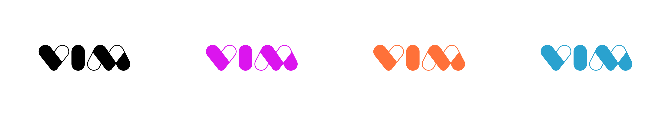
Logo System
Download logos
2.1a
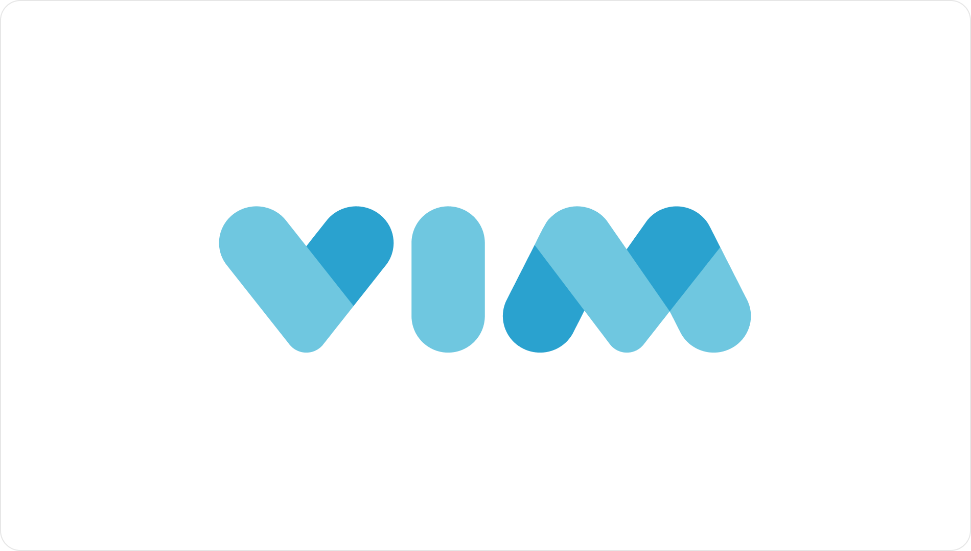
Primary Logotype
2.1b
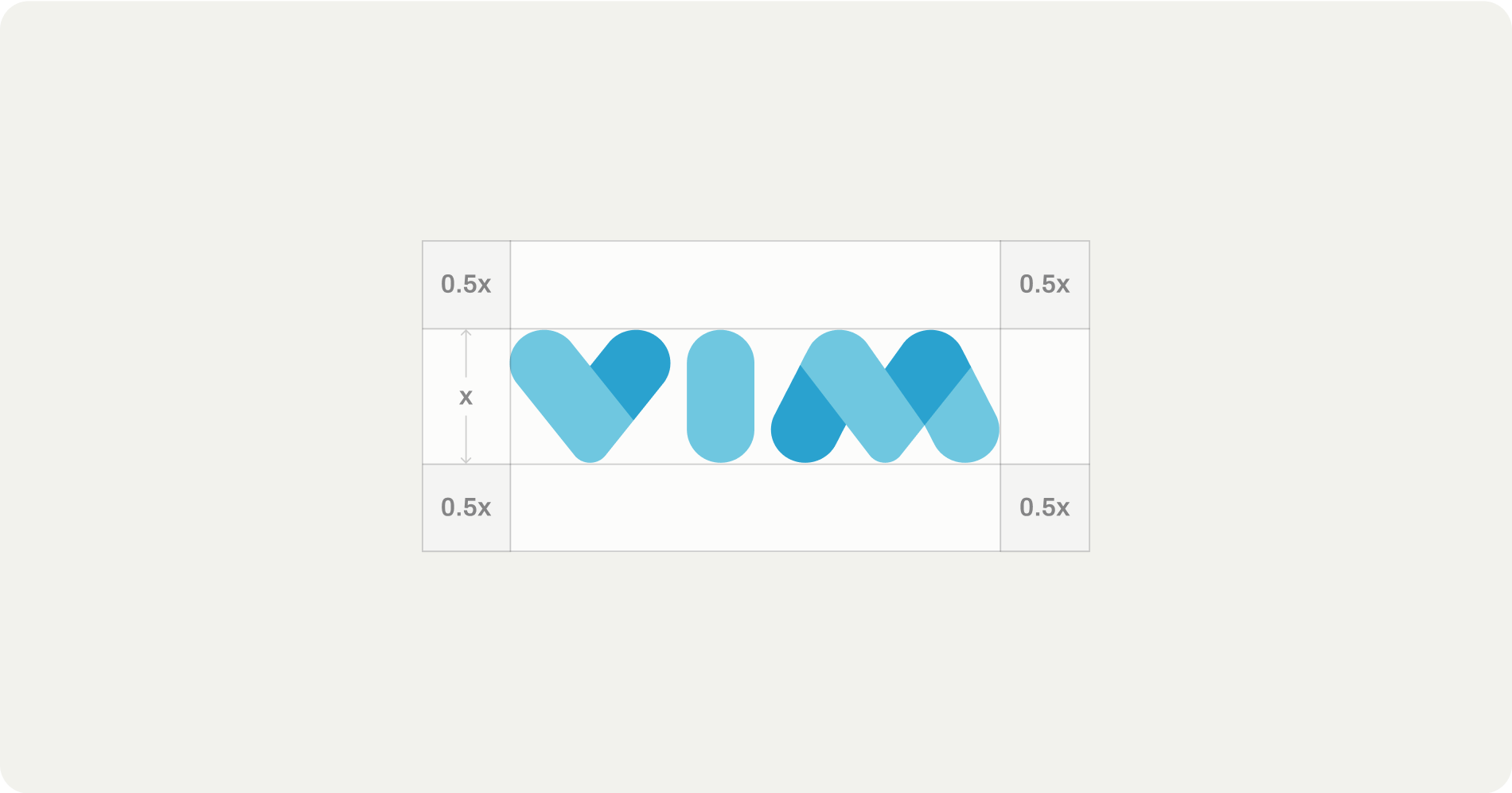
Clearspace
2.1c
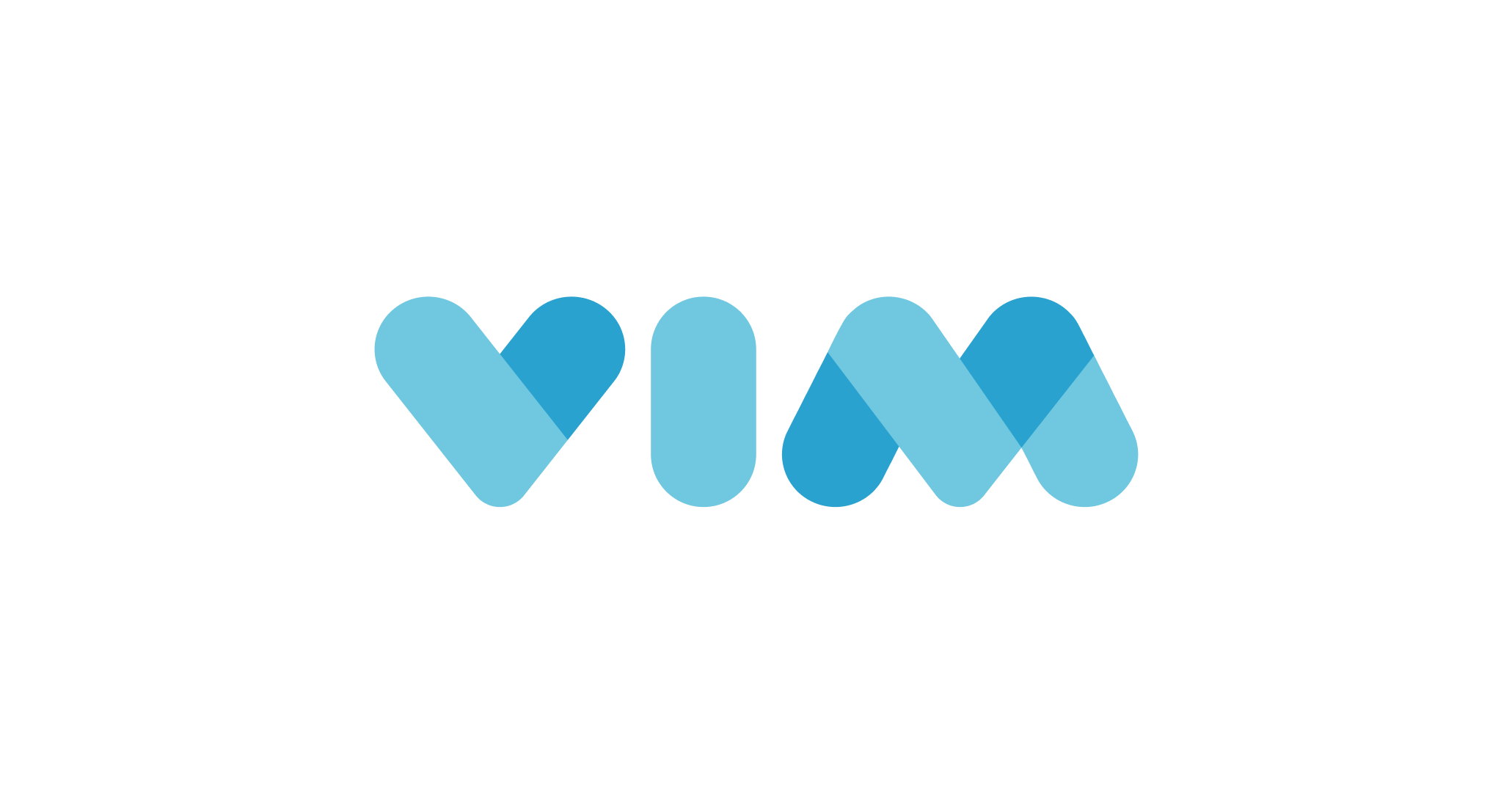
Secondary Logotype
2.1d
Primary Logomark

2.1e
Secondary Logomark


Download logos

2.2
Logo Use Guidelines
- No alterations - The Vim logo must never be redrawn, stretched, condensed, rotated, or otherwise altered. Do not create alternative versions, sub-brands, or “special editions” of the logo outside of the approved system.
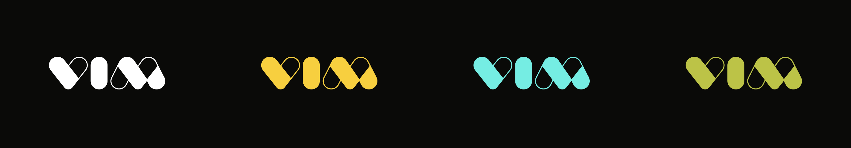
- No unapproved colors or effects - The logo may only appear in the brand’s approved colors or black/white as specified in this guide. Gradients, drop shadows, outlines, bevels, or other visual effects applied to the logo are not permitted.
- Maintain clear space and integrity - Always maintain the required clear space around the logo. No text, graphics, or imagery should encroach.
- One source of truth - Only the assets and logo variations provided in the brand guide are approved for use. Logos found elsewhere (screenshots, Google Images, recreations, etc.) must not be used.
- No co-branding without approval - In joint marketing, event sponsorships, or partner placements, the Vim logo must only be used in accordance with brand guidelines and with prior approval from the brand team.
2.3
Color Palette
2.3a
Primary Palette
Cerulean
#2AA2CF
Light Blue
#6FC7E0
Black
#0A0A08
Grey
#F2F2ED
Vim’s primary colors represent the core of our brand identity. These should be used most frequently across key touchpoints such as the logo and primary brand materials. They ensure strong brand recognition and visual consistency across all platforms.
2.3b
Secondary Palette
Sand
#BCC347
Magenta
#DB15EE
Orange
#FF7139
Gold
#F7CF3F
Teal
#77EDE3
The secondary colors are meant to complement the primary palette. Use them to add depth, contrast, or emphasis in design elements like infographics, charts, and supporting visuals. They should enhance the primary colors without overpowering them, maintaining a cohesive and balanced look.
2.3c
Gradient Palette
Vim’s gradients convey flow and connection, visually expressing how we unify complex systems into a seamless, intelligent experience. They should be used as background elements, overlays, or motion accents to add depth and cohesion across brand assets while maintaining clarity and balance.
2.4
Typography
Primary Typeface
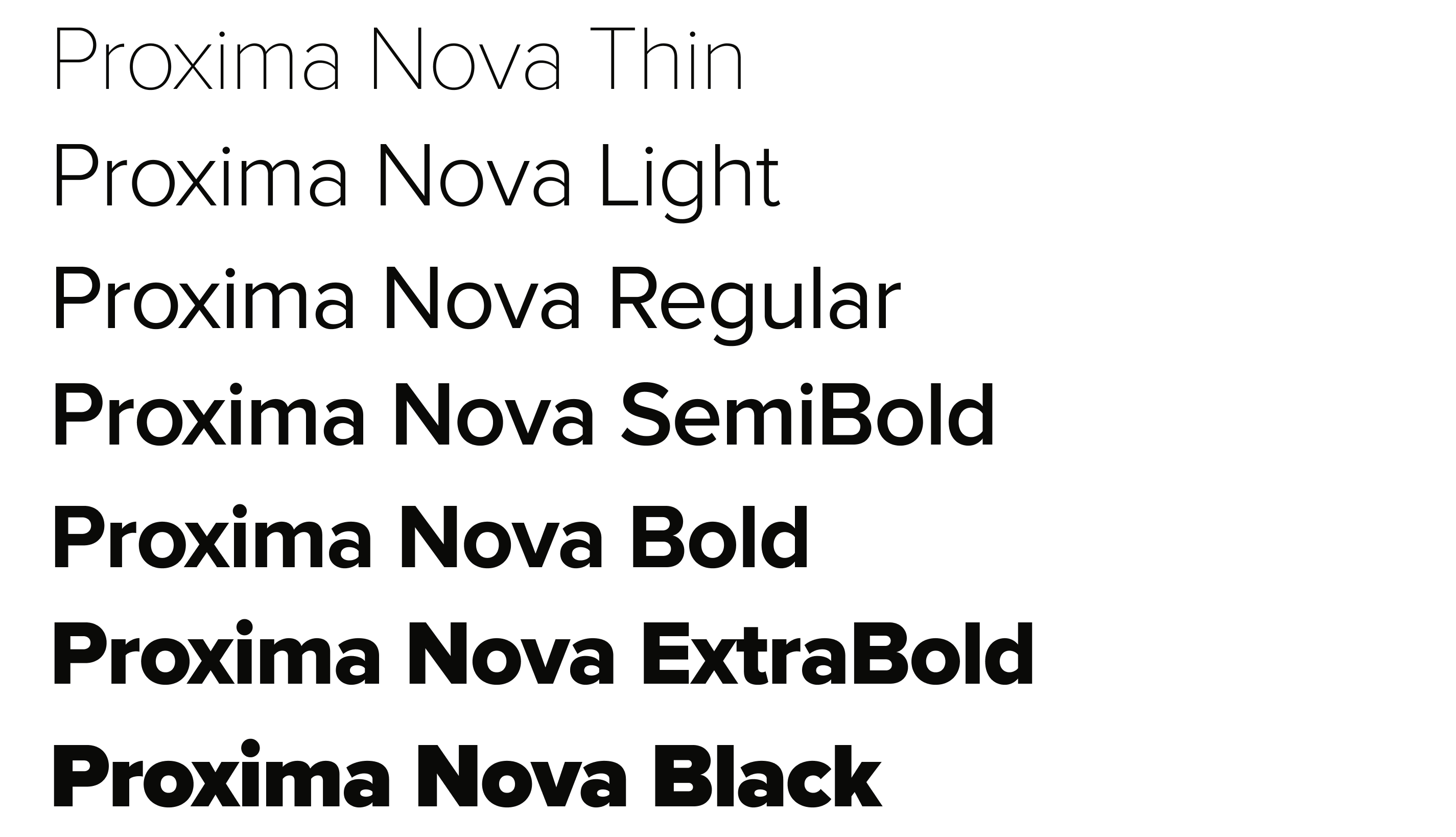
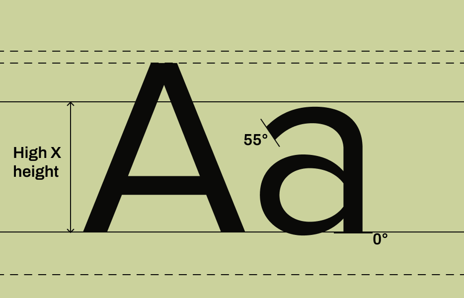
Proxima Nova is a popular, versatile, and geometric sans-serif typeface designed by Mark Simonson. It blends the clean, modern aesthetic of geometric sans-serifs with the warmth and readability of humanist typefaces.
Get font
Sample Iconography


Iconography & Graphic Elements Guidelines
- No open-source graphics or clipart - Do not use default clipart, cartoonish icons, or open-source graphics libraries that don’t align with our style. Clipart cheapens the brand and undermines the credibility we need in healthcare.
- No mixed styles - Do not combine flat vector graphics with 3D renders, skeuomorphic icons, or hand-drawn doodles in the same design. Consistency is critical; everything should feel like it comes from the same family.
- No cartoon characters or mascots - Do not create characters (e.g., “doctor avatars” or “friendly robots”) unless explicitly part of an approved campaign. They dilute the professionalism of the brand and risk being seen as childish.
- No unauthorized icon sets - Do not pull icons from Google, Canva, or stock sites and drop them into presentations or collateral. Only use the official Vim iconography system. If new icons are needed, reach out to Madi on the marketing team.
- No off-palette colors - Do not use neon tones, pastels, or colors outside the Vim palette to make illustrations “pop.” Stick to the brand palette to maintain consistency across touchpoints.
If new icons are needed, reach out to the marketing team for help with design.
Download full iconography set
3.0
Brand Applications
The following brand applications are available as approved, ready-to-use resources. Always start from these templates and files rather than creating your own.
3.1 Email Templates
Marketing emails are sent through Hubspot and should be approved by the marketing team for brand consistency and to ensure there are not multiple comms going out in a single day.
Email templates can be found when creating a new email in Hubspot. Additional graphic elements can be requested through the Marketing Request Form.
3.2 Presentation Templates
The official Vim-branded presentation template is available in Vim’s Google Workspace. Company slide decks should not stray from the slide designs in the brand template. If you feel the template is missing any design components, let the marketing team know before building something from scratch.
To apply the template to your own slide deck:
- On your computer, open a presentation in Google Slides.
- At the top, click Slide > Change theme.
- On the right, click the “Import theme” at the bottom.
- Search for “2025 Vim Brand Template” and select.
- In the bottom right, click “Import”
3.3 Content Assets & Sales Collateral
All of our content assets and enablement materials live in the Marketing & Sales Enablement Portal for easy access. Any new one-pagers, slide decks, reports, case studies, or enablement collateral should be created by the marketing team and requested through the Marketing Request Form.
If you are creating a simple document that you would like to be on a branded background, use the approved Document Template and ensure the content is set to our brand font, Proxima Nova.
4.0
Governance & Access
To keep Vim’s brand consistent, strong, and trusted, we all need to work from a single source of truth. This section defines where to find approved assets, how to use them, and who to contact with questions. Following these guardrails ensures that every presentation, customer touchpoint, and marketing asset reflects Vim’s identity with clarity and professionalism.
4.1 Centralized Brand Portal
All brand resources live in one place. The Marketing & Sales Enablement Portal is the only approved source for logos, fonts, color palettes, icons, templates, and content assets. If it’s not in the Portal, it’s not part of the brand. If you believe it should be in the Portal, let the marketing team know.
4.2 Brand Do’s & Don’ts
✅ Do’s
- Do use the brand portal as your single source of truth for logos, fonts, colors, icons, and templates.
- Do keep it simple and clear — prioritize readability and real-world impact over jargon or clutter.
- Do maintain consistency across all touchpoints, from sales decks to product UI to social media.
- Do follow hierarchy in type, color, and layout to guide the reader’s eye.
- Do check accessibility — the marketing team can help you ensure color contrast and text size meet inclusive design standards.
- Do escalate when unsure — ask the marketing team if something feels off or unapproved.
❌ Don’ts
- Don’t improvise with logos — no recoloring, resizing beyond rules, or creating “special” versions.
- Don’t use clipart, random icons, or stock styles that clash with the approved illustration system.
- Don’t mix old branding (legacy colors, logos, or templates) with the new system.
- Don’t overload designs with too many fonts, colors, or visual elements.
- Don’t write in jargon-heavy or overly technical language — clarity builds trust, not complexity.
- Don’t use imagery that feels staged, generic, or inauthentic (smiling doctors with stethoscopes, sterile stock shots).
- Don’t bypass governance — avoid using materials not sourced from the brand portal or approved by the marketing team.
4.3 Approval & Escalation Process
Any new creative request outside of approved elements must be submitted to the marketing team using the Marketing Request Form. Requests should be made as early as possible, with at least a week's notice for new assets. Using unapproved logos, colors, or visuals undermines brand consistency and will need to be corrected.
4.4 Marketing Team Contact
For any questions about our brand, contact the marketing team. We are here to support you!
Madi Duffy
Marketing Manager
When should you reach out to Madi?
- Day-to-day support for marketing collateral and campaign execution
- Brand asset requests (presentations, one-pagers, templates)
- First point of contact for questions about the brand hub and creative resources. If unsure, start with Madi.
Nicole Hess
VP of Marketing
When should you reach out to Nicole?
- Strategic oversight of brand, positioning, and messaging
- Final approvals for new brand initiatives or major campaigns
- Escalations when guidance is unclear or decisions cut across teams

Vim © 2025
All Rights Reserved
Brand
Manual
Welcome to the Vim Brand Manual.
This brand manual is our shared guide for telling Vim’s story with clarity and consistency. It exists to help every one of us communicate with confidence, so our audiences experience the same bold, modern, and trustworthy Vim at every touchpoint.
View brand kit
View employee kit
Table of Contents
1.0
Brand Foundations
1.1 Positioning Statement
Vim is the transformational platform modernizing healthcare, not just improving it incrementally.
- A frictionless ecosystem: where providers, care teams, payers, and developers collaborate seamlessly to close gaps, align incentives, and deliver value-based outcomes.
- An AI-driven growth engine: powering intelligent automation, context-aware insights, and scalable innovation across the ecosystem.
- A trusted infrastructure: secure, compliant, and simple to adopt, enabling care orchestration and real-world impact.
- The healthcare app marketplace: the fastest way to embed innovations directly into clinical workflows.
In short: Vim positions itself as the bold alternative to outdated, fragmented systems; a next-generation, developer-first platform that embeds the right tools directly into clinical workflows to eliminate friction, accelerate innovation, and improve outcomes across healthcare.
1.4 Brand Principles
Brand principles are the core beliefs and guiding values that shape how a brand operates, communicates, and delivers value. They are the foundation of a brand’s identity both visually and verbally, helping to ensure consistency across messaging, product development, and customer interactions.
2.0
Core Visual Identity
2.1
Logo System
Download logos
2.1a
Primary Logotype
2.1b
Clearspace
2.1c
Secondary Logotype
2.1d
Primary Logomark
2.1e
Secondary Logomark
Download logos
2.2
Logo Use Guidelines
- No alterations - The Vim logo must never be redrawn, stretched, condensed, rotated, or otherwise altered. Do not create alternative versions, sub-brands, or “special editions” of the logo outside of the approved system.
- No unapproved colors or effects - The logo may only appear in the brand’s approved colors or black/white as specified in this guide. Gradients, drop shadows, outlines, bevels, or other visual effects applied to the logo are not permitted.
- Maintain clear space and integrity - Always maintain the required clear space around the logo. No text, graphics, or imagery should encroach.
- One source of truth - Only the assets and logo variations provided in the brand guide are approved for use. Logos found elsewhere (screenshots, Google Images, recreations, etc.) must not be used.
- No co-branding without approval - In joint marketing, event sponsorships, or partner placements, the Vim logo must only be used in accordance with brand guidelines and with prior approval from the brand team.
2.3
Color Palette
2.3a
Primary Palette
Cerulean
#2AA2CF
Light Blue
#6FC7E0
Black
#0A0A08
Grey
#F2F2ED
Vim’s primary colors represent the core of our brand identity. These should be used most frequently across key touchpoints such as the logo and primary brand materials. They ensure strong brand recognition and visual consistency across all platforms.
2.3b
Secondary Palette
Sand
#BCC347
Magenta
#DB15EE
Orange
#FF7139
Gold
#F7CF3F
Teal
#77EDE3
The secondary colors are meant to complement the primary palette. Use them to add depth, contrast, or emphasis in design elements like infographics, charts, and supporting visuals. They should enhance the primary colors without overpowering them, maintaining a cohesive and balanced look.
2.3c
Gradient Palette
Vim’s gradients convey flow and connection, visually expressing how we unify complex systems into a seamless, intelligent experience. They should be used as background elements, overlays, or motion accents to add depth and cohesion across brand assets while maintaining clarity and balance.
2.4
Typography
Primary Typeface
Proxima Nova is a popular, versatile, and geometric sans-serif typeface designed by Mark Simonson. It blends the clean, modern aesthetic of geometric sans-serifs with the warmth and readability of humanist typefaces.
Get font

Iconography & Graphic Elements Guidelines
- No open-source graphics or clipart - Do not use default clipart, cartoonish icons, or open-source graphics libraries that don’t align with our style. Clipart cheapens the brand and undermines the credibility we need in healthcare.
- No mixed styles - Do not combine flat vector graphics with 3D renders, skeuomorphic icons, or hand-drawn doodles in the same design. Consistency is critical; everything should feel like it comes from the same family.
- No cartoon characters or mascots - Do not create characters (e.g., “doctor avatars” or “friendly robots”) unless explicitly part of an approved campaign. They dilute the professionalism of the brand and risk being seen as childish.
- No unauthorized icon sets - Do not pull icons from Google, Canva, or stock sites and drop them into presentations or collateral. Only use the official Vim iconography system. If new icons are needed, reach out to Madi on the marketing team.
- No off-palette colors - Do not use neon tones, pastels, or colors outside the Vim palette to make illustrations “pop.” Stick to the brand palette to maintain consistency across touchpoints.
If new icons are needed, reach out to the marketing team for help with design.
Download full iconography set
3.0
Brand Applications
The following brand applications are available as approved, ready-to-use resources. Always start from these templates and files rather than creating your own.
3.1 Email Templates
Marketing emails are sent through Hubspot and should be approved by the marketing team for brand consistency and to ensure there are not multiple comms going out in a single day.
Email templates can be found when creating a new email in Hubspot. Additional graphic elements can be requested through the Marketing Request Form.
3.2 Presentation Templates
The official Vim-branded presentation template is available in Vim’s Google Workspace. Company slide decks should not stray from the slide designs in the brand template. If you feel the template is missing any design components, let the marketing team know before building something from scratch.
To apply the template to your own slide deck:
- On your computer, open a presentation in Google Slides.
- At the top, click Slide > Change theme.
- On the right, click the “Import theme” at the bottom.
- Search for “2025 Vim Brand Template” and select.
- In the bottom right, click “Import”
3.3 Content Assets & Sales Collateral
All of our content assets and enablement materials live in the Marketing & Sales Enablement Portal for easy access. Any new one-pagers, slide decks, reports, case studies, or enablement collateral should be created by the marketing team and requested through the Marketing Request Form.
If you are creating a simple document that you would like to be on a branded background, use the approved Document Template and ensure the content is set to our brand font, Proxima Nova.
4.0
Governance & Access
To keep Vim’s brand consistent, strong, and trusted, we all need to work from a single source of truth. This section defines where to find approved assets, how to use them, and who to contact with questions. Following these guardrails ensures that every presentation, customer touchpoint, and marketing asset reflects Vim’s identity with clarity and professionalism.
4.1 Centralized Brand Portal
All brand resources live in one place. The Marketing & Sales Enablement Portal is the only approved source for logos, fonts, color palettes, icons, templates, and content assets. If it’s not in the Portal, it’s not part of the brand. If you believe it should be in the Portal, let the marketing team know.
4.2 Brand Do’s & Don’ts
✅ Do’s
- Do use the brand portal as your single source of truth for logos, fonts, colors, icons, and templates.
- Do keep it simple and clear — prioritize readability and real-world impact over jargon or clutter.
- Do maintain consistency across all touchpoints, from sales decks to product UI to social media.
- Do follow hierarchy in type, color, and layout to guide the reader’s eye.
- Do check accessibility — the marketing team can help you ensure color contrast and text size meet inclusive design standards.
- Do escalate when unsure — ask the marketing team if something feels off or unapproved.
❌ Don’ts
- Don’t improvise with logos — no recoloring, resizing beyond rules, or creating “special” versions.
- Don’t use clipart, random icons, or stock styles that clash with the approved illustration system.
- Don’t mix old branding (legacy colors, logos, or templates) with the new system.
- Don’t overload designs with too many fonts, colors, or visual elements.
- Don’t write in jargon-heavy or overly technical language — clarity builds trust, not complexity.
- Don’t use imagery that feels staged, generic, or inauthentic (smiling doctors with stethoscopes, sterile stock shots).
- Don’t bypass governance — avoid using materials not sourced from the brand portal or approved by the marketing team.
4.3 Approval & Escalation Process
Any new creative request outside of approved elements must be submitted to the marketing team using the Marketing Request Form. Requests should be made as early as possible, with at least a week's notice for new assets. Using unapproved logos, colors, or visuals undermines brand consistency and will need to be corrected.
4.4 Marketing Team Contact
For any questions about our brand, contact the marketing team. We are here to support you!
Madi Duffy
Marketing Manager
When should you reach out to Madi?
- Day-to-day support for marketing collateral and campaign execution
- Brand asset requests (presentations, one-pagers, templates)
- First point of contact for questions about the brand hub and creative resources. If unsure, start with Madi.
Nicole Hess
VP of Marketing
When should you reach out to Nicole?
- Strategic oversight of brand, positioning, and messaging
- Final approvals for new brand initiatives or major campaigns
- Escalations when guidance is unclear or decisions cut across teams

Vim © 2025
All Rights Reserved

Brand
Manual
Welcome to the Vim Brand Manual.
This brand manual is our shared guide for telling Vim’s story with clarity and consistency. It exists to help every one of us communicate with confidence, so our audiences experience the same bold, modern, and trustworthy Vim at every touchpoint.
View brand kit
View employee kit
Table of Contents
1.0
Brand Foundations
1.1 Positioning Statement
Vim is the transformational platform modernizing healthcare, not just improving it incrementally.
- A frictionless ecosystem: where providers, care teams, payers, and developers collaborate seamlessly to close gaps, align incentives, and deliver value-based outcomes.
- An AI-driven growth engine: powering intelligent automation, context-aware insights, and scalable innovation across the ecosystem.
- A trusted infrastructure: secure, compliant, and simple to adopt, enabling care orchestration and real-world impact.
- The healthcare app marketplace: the fastest way to embed innovations directly into clinical workflows.
In short: Vim positions itself as the bold alternative to outdated, fragmented systems; a next-generation, developer-first platform that embeds the right tools directly into clinical workflows to eliminate friction, accelerate innovation, and improve outcomes across healthcare.
1.4 Brand Principles
Brand principles are the core beliefs and guiding values that shape how a brand operates, communicates, and delivers value. They are the foundation of a brand’s identity both visually and verbally, helping to ensure consistency across messaging, product development, and customer interactions.
2.0
Core Visual Identity
2.1
Logo System
Download logos
2.1a
Primary Logotype
2.1b
Clearspace
2.1c
Secondary Logotype
2.1d
Primary Logomark
2.1e
Secondary Logomark
Download logos

2.2
Logo Use Guidelines
- No alterations - The Vim logo must never be redrawn, stretched, condensed, rotated, or otherwise altered. Do not create alternative versions, sub-brands, or “special editions” of the logo outside of the approved system.
- No unapproved colors or effects - The logo may only appear in the brand’s approved colors or black/white as specified in this guide. Gradients, drop shadows, outlines, bevels, or other visual effects applied to the logo are not permitted.
- Maintain clear space and integrity - Always maintain the required clear space around the logo. No text, graphics, or imagery should encroach.
- One source of truth - Only the assets and logo variations provided in the brand guide are approved for use. Logos found elsewhere (screenshots, Google Images, recreations, etc.) must not be used.
- No co-branding without approval - In joint marketing, event sponsorships, or partner placements, the Vim logo must only be used in accordance with brand guidelines and with prior approval from the brand team.
2.3
Color Palette
2.3a
Primary Palette
Cerulean
#2AA2CF
Light Blue
#6FC7E0
Grey
#F2F2ED
Black
#0A0A08
Vim’s primary colors represent the core of our brand identity. These should be used most frequently across key touchpoints such as the logo and primary brand materials. They ensure strong brand recognition and visual consistency across all platforms.
2.3b
Secondary Palette
Sand
#BCC347
Magenta
#DB15EE
Orange
#FF7139
Gold
#F7CF3F
Teal
#77EDE3
The secondary colors are meant to complement the primary palette. Use them to add depth, contrast, or emphasis in design elements like infographics, charts, and supporting visuals. They should enhance the primary colors without overpowering them, maintaining a cohesive and balanced look.
2.3c
Gradient Palette
Vim’s gradients convey flow and connection, visually expressing how we unify complex systems into a seamless, intelligent experience. They should be used as background elements, overlays, or motion accents to add depth and cohesion across brand assets while maintaining clarity and balance.
2.4
Typography
Primary Typeface
Proxima Nova is a popular, versatile, and geometric sans-serif typeface designed by Mark Simonson. It blends the clean, modern aesthetic of geometric sans-serifs with the warmth and readability of humanist typefaces.
Get font
Sample Iconography


Iconography & Graphic Elements Guidelines
- No open-source graphics or clipart - Do not use default clipart, cartoonish icons, or open-source graphics libraries that don’t align with our style. Clipart cheapens the brand and undermines the credibility we need in healthcare.
- No mixed styles - Do not combine flat vector graphics with 3D renders, skeuomorphic icons, or hand-drawn doodles in the same design. Consistency is critical; everything should feel like it comes from the same family.
- No cartoon characters or mascots - Do not create characters (e.g., “doctor avatars” or “friendly robots”) unless explicitly part of an approved campaign. They dilute the professionalism of the brand and risk being seen as childish.
- No unauthorized icon sets - Do not pull icons from Google, Canva, or stock sites and drop them into presentations or collateral. Only use the official Vim iconography system. If new icons are needed, reach out to Madi on the marketing team.
- No off-palette colors - Do not use neon tones, pastels, or colors outside the Vim palette to make illustrations “pop.” Stick to the brand palette to maintain consistency across touchpoints.
If new icons are needed, reach out to the marketing team for help with design.
Download full iconography set
3.0
Brand Applications
The following brand applications are available as approved, ready-to-use resources. Always start from these templates and files rather than creating your own.
3.1 Email Templates
Marketing emails are sent through Hubspot and should be approved by the marketing team for brand consistency and to ensure there are not multiple comms going out in a single day.
Email templates can be found when creating a new email in Hubspot. Additional graphic elements can be requested through the Marketing Request Form.
3.2 Presentation Templates
The official Vim-branded presentation template is available in Vim’s Google Workspace. Company slide decks should not stray from the slide designs in the brand template. If you feel the template is missing any design components, let the marketing team know before building something from scratch.
To apply the template to your own slide deck:
- On your computer, open a presentation in Google Slides.
- At the top, click Slide > Change theme.
- On the right, click the “Import theme” at the bottom.
- Search for “2025 Vim Brand Template” and select.
- In the bottom right, click “Import”
3.3 Content Assets & Sales Collateral
All of our content assets and enablement materials live in the Marketing & Sales Enablement Portal for easy access. Any new one-pagers, slide decks, reports, case studies, or enablement collateral should be created by the marketing team and requested through the Marketing Request Form.
If you are creating a simple document that you would like to be on a branded background, use the approved Document Template and ensure the content is set to our brand font, Proxima Nova.
4.0
Governance & Access
To keep Vim’s brand consistent, strong, and trusted, we all need to work from a single source of truth. This section defines where to find approved assets, how to use them, and who to contact with questions. Following these guardrails ensures that every presentation, customer touchpoint, and marketing asset reflects Vim’s identity with clarity and professionalism.
4.1 Centralized Brand Portal
All brand resources live in one place. The Marketing & Sales Enablement Portal is the only approved source for logos, fonts, color palettes, icons, templates, and content assets. If it’s not in the Portal, it’s not part of the brand. If you believe it should be in the Portal, let the marketing team know.
4.2 Brand Do’s & Don’ts
✅ Do’s
- Do use the brand portal as your single source of truth for logos, fonts, colors, icons, and templates.
- Do keep it simple and clear — prioritize readability and real-world impact over jargon or clutter.
- Do maintain consistency across all touchpoints, from sales decks to product UI to social media.
- Do follow hierarchy in type, color, and layout to guide the reader’s eye.
- Do check accessibility — the marketing team can help you ensure color contrast and text size meet inclusive design standards.
- Do escalate when unsure — ask the marketing team if something feels off or unapproved.
❌ Don’ts
- Don’t improvise with logos — no recoloring, resizing beyond rules, or creating “special” versions.
- Don’t use clipart, random icons, or stock styles that clash with the approved illustration system.
- Don’t mix old branding (legacy colors, logos, or templates) with the new system.
- Don’t overload designs with too many fonts, colors, or visual elements.
- Don’t write in jargon-heavy or overly technical language — clarity builds trust, not complexity.
- Don’t use imagery that feels staged, generic, or inauthentic (smiling doctors with stethoscopes, sterile stock shots).
- Don’t bypass governance — avoid using materials not sourced from the brand portal or approved by the marketing team.
4.3 Approval & Escalation Process
Any new creative request outside of approved elements must be submitted to the marketing team using the Marketing Request Form. Requests should be made as early as possible, with at least a week's notice for new assets. Using unapproved logos, colors, or visuals undermines brand consistency and will need to be corrected.
4.4 Marketing Team Contact
For any questions about our brand, contact the marketing team. We are here to support you!
Madi Duffy
Marketing Manager
When should you reach out to Madi?
- Day-to-day support for marketing collateral and campaign execution
- Brand asset requests (presentations, one-pagers, templates)
- First point of contact for questions about the brand hub and creative resources. If unsure, start with Madi.
Nicole Hess
VP of Marketing
When should you reach out to Nicole?
- Strategic oversight of brand, positioning, and messaging
- Final approvals for new brand initiatives or major campaigns
- Escalations when guidance is unclear or decisions cut across teams

Vim © 2025
All Rights Reserved